

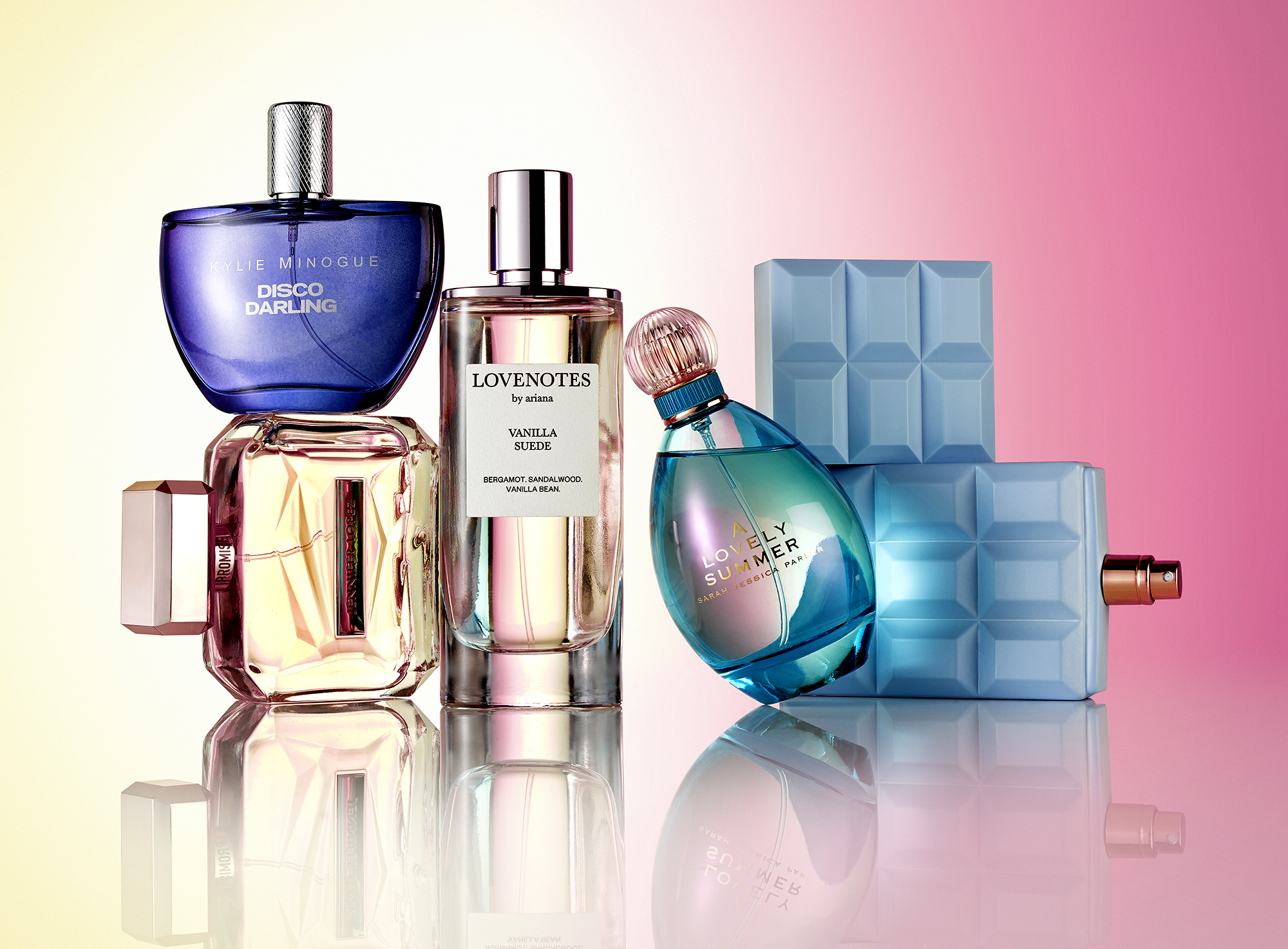
A perfume bottle is the hardest thing in still-life photography to get right.
Glass behaves unpredictably under light. The juice inside has its own colour and refractive properties. The atomiser, the collar, and the cap each have different finishes and require different lighting attention. The bottle is often the brand’s largest single design investment, and the photograph has to honour that investment without the studio adding flourish that was not there to begin with.
This guide is for fragrance brands and creative leads commissioning bottle photography in London. It is about how a specialist studio approaches the technical reality of capturing fragrance, and what to brief differently from any other product category.
Why perfume is the hardest still-life category
Most product categories present one main lighting problem. Watches present finish. Skincare presents jar shape and label legibility. Drinks present pour and condensation.
Perfume presents at least four lighting problems on the same bottle, and they have to be solved together rather than in sequence.
The glass has to read as the specific glass it is: clear, frosted, smoked, coloured, sculptural, polygonal, ribbed. Each behaves differently under light.
The juice has to read at its actual colour, accounting for the fact that the glass tints what is visible through it. A pale amber juice in a heavy bottle reads as deeper amber on camera unless the lighting compensates.
The atomiser, collar, cap, and any decorative metal or sculptural detail have to read as their actual material. A gilt collar shot under cool light reads as silver. A polished chrome cap shot under warm light reads as gold.
The branding (etched, printed, applied logos, embossed lettering) has to read at its actual depth and finish. Etched glass looks flat under wrong-angle light. Printed branding can disappear into the bottle’s curvature.
Solving all four together, in one lighting setup, is what specialist fragrance photography is for.
Glass: reflection, refraction and the contents trap
Glass is the bottle’s defining material problem.
Clear glass refracts light through the contents. The lighting setup has to account for what the customer will see on the other side of the glass: the juice, the bottle’s back wall, any reflective elements behind the bottle. Mismanaged, the photograph shows the studio environment through the glass instead of a clean composition.
Frosted and matte-finish glass diffuses light entering the bottle. The lighting setup has to compensate for the diffusion or the bottle reads as flat. Side-lighting that picks up the surface texture without flattening the form gives the cleanest result.
Coloured glass tints the juice visible through it. A pink-glass bottle containing pale juice will photograph as pinker than the customer sees in real life unless the lighting and retouch correct for it.
Sculptural and polygonal bottles (Hermès, Gaultier, Mugler, many luxury houses) have refractive faces that throw light unpredictably. Each face needs to read cleanly without becoming a mirror that reveals the studio.
The general principle: the glass is part of the photograph, but the photograph is not about the glass. The lighting decisions exist to let the customer see through the glass to the bottle’s contents and form.
Gradient: capturing colour transition without compression
Many fragrance bottles have gradient colour, either in the glass itself or in the juice.
Gradient is harder to photograph than solid colour because the camera has to capture the full transition smoothly. Compressed gradients (where the colour shift becomes a hard line) read as cheap. Smooth gradients (where the colour shifts gradually across the bottle’s height or curve) read as premium.
The lighting setup that preserves gradient: soft, broad source positioned to graze the bottle’s surface in a way that reveals the gradient without flattening it. A direct hard light kills the gradient. A purely back-lit setup reveals the gradient but loses the bottle’s surface character.
The capture has to be at high enough bit depth to preserve the gradient through retouch. JPEG-only delivery loses gradient smoothness; the master file should be a 16-bit format that holds the colour transition.
For brands whose bottle gradient is part of the brand identity (the Tom Ford Bitter Peach gradient, the Mugler Alien gradient, the Le Labo aged-paper gradient), the photograph has to honour the gradient’s role in the brand’s visual world.
Juice colour: true-to-tone across PDP, campaign and press
Juice colour is the second most-checked thing about a fragrance bottle photograph, after the bottle silhouette.
Customers who have bought a fragrance before know what the juice should look like. A new customer who is considering a fragrance often researches the actual juice colour as part of the buying decision, particularly for fragrances priced above £80.
The lighting and retouch discipline that holds juice colour true:
Calibrated colour temperature across the entire shoot. Mixed temperatures shift juice colour unpredictably.
A reference capture against a colour card at the start of the day, used to verify colour fidelity through the post-production process.
A retoucher briefed to match the brand’s existing reference (campaign work, the brand’s website, the actual liquid in the bottle on set) rather than to enhance.
For PDP imagery, the juice colour has to match what the customer sees on the brand’s existing campaign assets. For campaign hero, the juice colour should be honest while flattering. For press distribution, the colour profile should be aligned to the publication’s printing process where possible.
Atomiser, collar and cap: the trust details
The smaller elements of the bottle are where customers verify it is the real fragrance.
The atomiser (the spray nozzle) is often a brand-specific design. Some brands use coloured atomisers that signal the fragrance family. Some use shaped atomisers that match the bottle silhouette. The atomiser deserves at least one secondary shot in the asset matrix if it carries brand identity.
The collar (the metal or plastic ring between the bottle and the cap) often carries the brand name in raised or engraved lettering. It is small but commercially important. Lighting that reveals the collar’s text and finish supports the brand recognition.
The cap is usually the most-photographed secondary element, because removing the cap is part of the customer’s first interaction with the bottle. Cap-on photographs versus cap-off photographs are different shots, and most launches need both: cap-on for the hero composition, cap-off for the editorial close-up that shows the atomiser.
For luxury fragrances with sculpted or weighted caps (Tom Ford, Hermès, many of the Maison Francis Kurkdjian range), the cap deserves its own dedicated detail shot.
Lighting logic for clear, frosted and tinted bottles
Three bottle types, three lighting approaches.
Clear bottles need lighting that defines the form without flooding the bottle with environmental reflection. A controlled gradient lighting setup, often using a large diffused source positioned above and behind, with carefully placed reflectors to define the bottle’s edges.
Frosted bottles need light that picks up the surface texture without flattening the silhouette. Side-lighting works well, with the angle calibrated to the bottle’s specific form.
Tinted bottles need lighting that respects the glass colour while keeping the juice and form readable. The lighting setup often combines back-lighting (to push the tint forward) with controlled fill (to keep the bottle’s three-dimensional form).
For sculpted and polygonal bottles, the lighting setup is bespoke to the bottle’s geometry. The studio tests against the actual bottle (or a reference sample) before the day starts, not during it.
A briefing checklist for fragrance launches
The strongest fragrance briefs we receive include:
The bottle reference (preferably a sample sent in advance, not just product photography). The juice colour reference (the brand’s existing campaign or website imagery). The asset matrix by destination, with PDP, campaign, retailer-specific, social, and press all listed. The brand’s existing perfume photography style (the visual register the new shoot needs to align with). The on-set requirements (any custodian needed, sample handling notes, transit case logistics). The delivery deadline.
What does not need to be in the brief: lighting instructions, camera settings, attempts to specify the production technically. Those decisions belong to the studio.
If you would like help scoping a fragrance shoot, share the bottle reference and we will plan the lighting before you ship a sample. We work across perfume photography and the wider beauty and beauty textures categories at the Bankside studio.
Share your brief. We will come back the same day.