

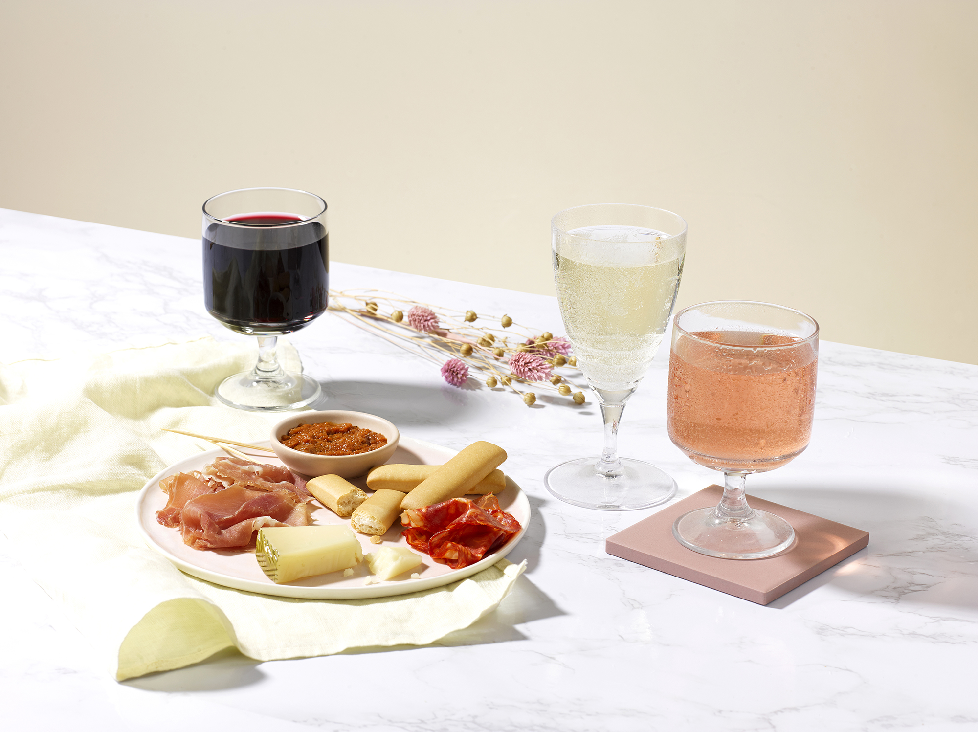
Drinks photography is one of the most technically demanding categories in still-life work.
The product is not stationary. The pour, the bubbles, the condensation, the ice, the surface tension on the meniscus, all behave physically in ways the studio has to either anticipate, control, or composite. Get it right and the photograph sells the drink. Get it wrong and the customer can tell, even if they cannot articulate why.
This guide is for drinks brand teams commissioning photography in the UK. It is about what good looks like across the technical decisions a drinks shoot requires, and what to brief differently from any other product category.
Drinks photography lives or dies on liquid behaviour
The thing that separates drinks photography from other still-life work is that the subject is moving.
A perfume bottle sits where you put it. A watch holds its position. A jewellery piece can be re-photographed at the same angle ten times and produce the same composition. A drink cannot. The pour shifts. The bubbles rise and fall. The condensation forms and runs. The ice melts. Every frame is captured against an unstable subject.
The studio’s job is to manage the instability. Some elements (the ice density, the meniscus level, the bubble distribution) can be staged. Some elements (the pour, the condensation, the foam on a beer, the carbonation in tonic water) have to be captured in a moment.
That moment-capture work is what specialist drinks photography is for. A studio that understands liquid behaviour produces frames that look effortless. A studio that does not produces frames that look staged in a way the customer can sense.
The pour: single take, multi-take, or composite
The pour is the most-photographed element in drinks marketing, and the most demanding.
Three approaches, each with trade-offs.
Single take. The pour is captured in one continuous shot, with high-speed flash to freeze the liquid mid-motion. Pro: the result is honest, with the actual physics of the pour on display. Con: requires multiple attempts, often dozens, to land a frame where the pour shape is commercially attractive.
Multi-take. Several pour attempts are captured at the same camera position with the same lighting, then the strongest one is selected as the final frame. Pro: higher hit rate than single take, still authentic. Con: the team has to commit to the camera position before knowing which pour will work.
Composite. The bottle and glass are photographed in one frame, the pour is photographed separately, and the two are combined in retouch. Pro: maximum control, predictable result. Con: the pour can read as composited if the lighting and physics are not perfectly matched.
Most premium drinks campaigns use the multi-take approach for hero shots and the composite approach for editorial or extreme creative work. The single-take approach is used when the brand specifically wants the photograph to feel documentary rather than constructed.
The brief should specify which approach the launch is using, because each requires different production time and different shot list assumptions.
Condensation, ice and bubbles: controlled, never fake
The supporting elements of drinks photography (condensation, ice, bubbles) all face the same temptation: they can be faked, but the customer can usually tell.
Condensation can be applied with glycerin spray, which creates persistent droplets that hold their shape under hot studio lights. The pattern of glycerin condensation often looks slightly different from real condensation: too uniform, too round, holding too rigidly. Specialist drinks shoots either use real condensation (achieved with proper temperature management of the glassware before the shot) or use glycerin in a pattern that mimics real behaviour.
Ice can be real or sculpted. Real ice melts under studio lights, which is a problem for any shoot that takes more than a few minutes per frame. Sculpted acrylic ice (used by most professional drinks photographers) holds its shape indefinitely and can be lit more precisely. The challenge with acrylic ice is making it read as actually cold; the lighting setup and the surrounding condensation are what sell it.
Bubbles in carbonated drinks are short-lived. The bubbles rise, the foam settles, the look of the drink changes within seconds. Fresh pours have to be captured immediately, or the bubbles re-induced through a careful re-pour.
The principle that holds: every supporting element should look real even when it is being managed for production reasons. Faked elements that look faked cheapen the brand.
Glassware: clarity, reflection, and the back-light trap
Glassware is the second-largest lighting problem in drinks photography after the liquid itself.
Clear glassware reflects the studio environment. Without controlled lighting, the glass shows whatever is behind the camera, the lighting equipment, the ceiling, the photographer. Specialist drinks photography uses controlled enclosures, deliberate background placement, and careful flag positioning to manage the reflections.
The back-light trap is one of the most common mistakes in amateur drinks photography. Lighting the drink from behind makes the liquid glow, which seems desirable, but flattens the glassware and loses the surface character. Specialist photography uses combined back-light and side-light, with the proportions calibrated to the specific drink and glassware.
Branded glassware (cocktail glasses with the brand’s logo etched, beer glasses with the brand’s logo applied, tumblers with branded engravings) deserves attention to the branding’s legibility. The customer often recognises the glassware as part of the brand’s visual identity, and the photograph should respect that recognition.
Labels: legibility, alignment and the variant problem
Drink labels are the part of the bottle the customer reads.
The label has to be in clear focus, properly oriented, and legible at the crops the launch will use. A label that is rotated slightly off-axis from frame to frame across a multi-product range looks careless. A label that is sharply lit on one bottle and softly lit on another reads as inconsistent.
Variant management within a range matters: a four-product whisky range needs all four labels at the same orientation, the same lighting, the same depth of focus. A six-product wine range with seasonal variations needs each variation to read clearly while the line as a whole stays coherent.
Embossed labels, foil labels, paper labels, and plastic labels each behave differently under light. The shoot has to either use a single lighting setup that respects all label types in the range, or sequence the variants by label type with adjusted lighting between subgroups.
The retoucher has to maintain label sharpness across all delivered files. Soft labels in retouch undersell the brand.
From hero pour to social motion in one shoot day
Most drinks launches need imagery across multiple formats from one production day.
The pattern that works:
Morning block for hero compositions. Bottle, glass, pour, garnish, the full scene that lives on the brand’s website and in the campaign assets. Multiple takes per composition to land the pour shapes that work.
Mid-morning block for product detail. Label close-ups, glassware close-ups, ingredient or garnish detail. The supporting imagery for the deep-scroll on the PDP and the press release.
Afternoon block for social and motion. Vertical crops for Reels, square crops for Instagram feed, GIF sequences showing the pour or the bubble motion, short video for paid social. Captured during the same lighting setup as the hero work where possible.
End-of-day block for any technical or experimental shots. The art-directed close-up. The atmospheric scene. The brand storytelling image that does not have a strict commercial assignment.
Single day, structured. Most drinks launches up to ten SKUs fit in one day with this structure.
A briefing checklist for drinks launches
The strongest drinks briefs we receive include:
The bottle samples (delivered one week ahead so the studio can pre-test). The brand’s preferred glassware (supplied for the shoot, or sourced by the studio against the brand’s specification). The asset matrix by destination, with PDP, campaign, retailer, social, and press all listed. Reference imagery from the brand’s existing campaign work. The pour style preferences (full pour, half pour, garnish-led, action-led). On-set requirements (custodian, brand attendance, sample replenishment for multiple takes). The delivery deadline.
What does not need to be in the brief: lighting instructions, technical setup specifications, attempts to specify the pour mechanics. Those decisions belong to the studio.
If you are scoping a drinks launch, share the bottle and the brief and we will plan the pour around the launch. We work across drinks photography and the broader product photography categories from our Bankside studio.
Share your brief. We will come back the same day.