

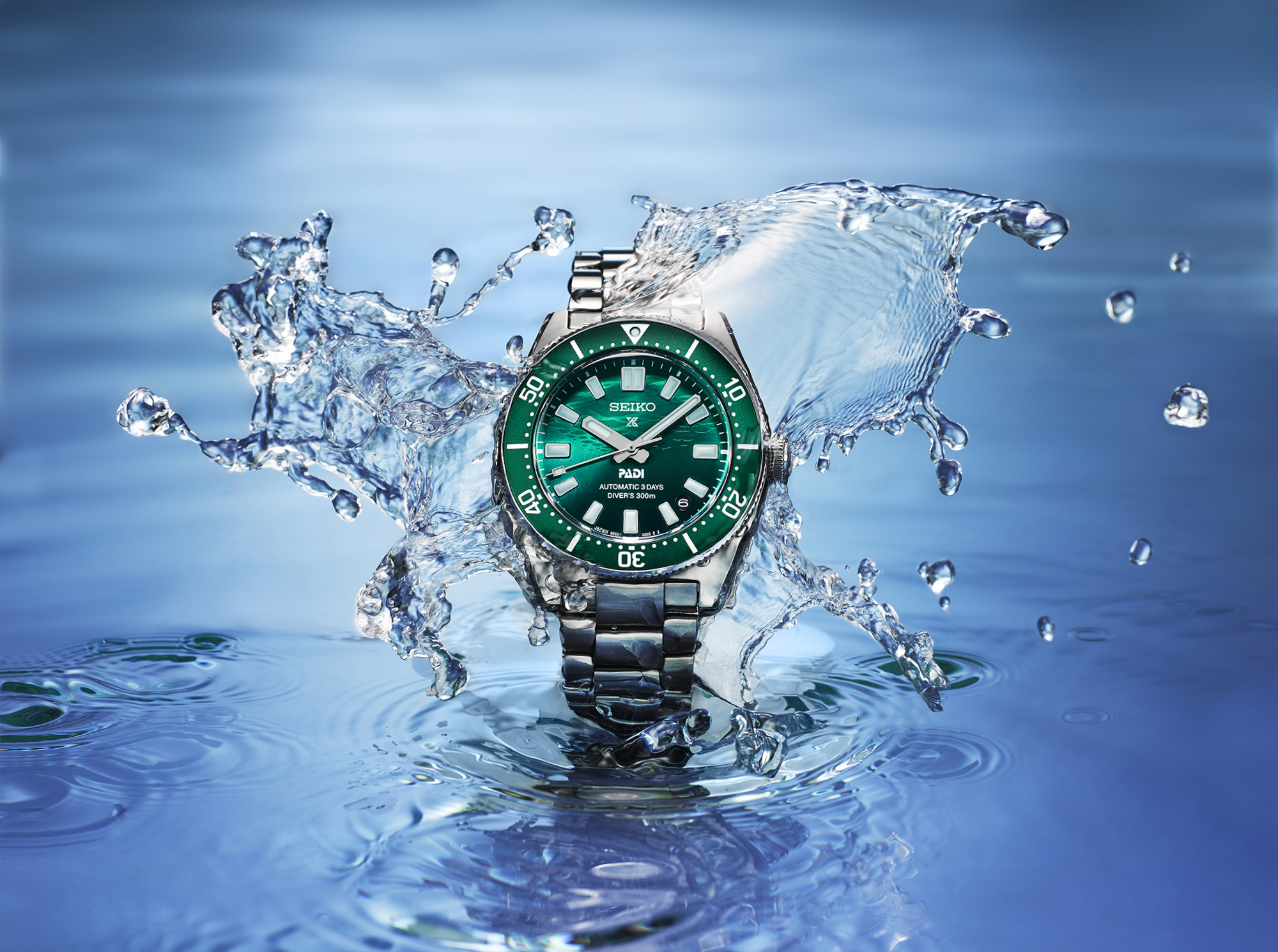
Independent watch brands face a specific challenge that established houses do not.
The established brand inherits decades of visual language. Rolex’s photography, Omega’s photography, Patek’s photography all sit inside conventions the customer has been trained to recognise. The independent brand has to build its own visual identity from scratch, often with limited budget, against established competitors who have spent years refining theirs.
The first commercial photography commission for an independent watch brand is often the moment the brand’s visual identity gets defined. The decisions made in that commission set the register for everything that follows. Get them right and the brand has a foundation to build on. Get them wrong and the brand spends years trying to reset.
This guide is for founders, brand directors, and creative leads at independent watch brands commissioning photography in London. It is about the visual identity decisions that matter most early on, and how to brief a studio to deliver work that establishes the brand rather than merely cataloguing the product.
The visual identity decisions that matter
The watch brand’s visual identity sits across four decisions.
Tonal register. Where the brand’s photography sits on the spectrum from clinical-precise to atmospheric-romantic. A specification-led brand often defaults to a cleaner register. A heritage-aspiration brand often defaults to a warmer register. Both are legitimate; the wrong choice for the brand’s commercial position is the problem.
Composition convention. Whether the brand defaults to centred hero compositions, off-centre dynamic compositions, or some specific signature framing. Established brands have recognisable composition signatures. Independent brands should choose one and hold it.
Light and shadow philosophy. Whether the brand’s photography uses soft, broad light (which signals refinement and quiet luxury) or directional, contrasty light (which signals dynamism and modernity). The lighting philosophy shapes how the brand’s product reads commercially.
Colour and material treatment. The brand’s calibrated approach to dial colours, metal finishes, and the relationship between the watch and its background. These choices accumulate into recognition over time.
These four decisions, made consciously, give the brand a visual identity that compounds across every subsequent photograph. Made unconsciously or inconsistently, they produce photography that feels generic.
Why these decisions matter early
For an independent brand, the first commercial photography commission is doing more than producing assets for a specific launch.
The imagery from that commission becomes the brand’s first visible expression to most of its potential customers. It anchors the brand’s website, its launch press distribution, its social presence, its retailer pitches. Future imagery references back to it.
A brand that establishes a strong visual identity early benefits from cumulative recognition. Every subsequent image strengthens the brand’s distinct visual voice. The watch press, the collector community, and the wider trade start to recognise the brand at a glance.
A brand that fails to establish a clear visual identity early ends up with imagery that drifts between registers across seasons. The drift undermines recognition. Customers, press, and retailers do not develop a clear sense of what the brand is visually.
The cost of getting this wrong is years of catch-up work to retroactively define the visual identity. The cost of getting it right early is minimal additional production effort compared to a less considered approach.
Building from the first piece
The strongest approach for an independent brand’s first watch photography commission is to lead with the hero piece.
The first hero photograph establishes the brand’s visual language. Every decision in that photograph (the angle, the lighting, the surface, the composition, the colour treatment) carries forward into subsequent imagery.
A specialist studio briefed for visual identity work spends significant time on the first piece. The hero is shot, reviewed, refined, and locked. Once the master is established, the rest of the production can be sequenced against it.
This is more intensive than typical commercial production, where every piece gets similar attention. But for an independent brand’s first commission, the investment in the hero pays back across every piece that follows.
The hero composition becomes the reference for the entire collection. Variations within the range stay anchored to the hero’s logic. The visual identity holds together because everything sits inside the same framework.
The reference question
Independent watch brands often arrive at their first commission with reference imagery from established houses.
This is natural and not wrong. The references communicate the brand’s aspirations. The studio learns about the visual register the brand is reaching for.
The mistake is to imitate the reference too closely. A new brand whose imagery looks like Rolex’s imagery does not read as a strong independent brand; it reads as a brand trying to be Rolex. The customer notices the imitation and the brand loses the chance to establish its own visual voice.
The conversation that works in the brief stage:
What do you like about this reference? Identify the specific elements (the composition, the lighting, the colour treatment) that the brand wants to draw from.
What would you do differently? Identify where the brand wants to depart from the reference, even within the same broad register.
What would feel like your brand specifically? Identify the elements that would make the brand recognisable as itself rather than as a derivative.
A studio that has this conversation with the brand at the briefing stage produces work that learns from the references without imitating them.
Practical production considerations
The practical realities of independent watch brand photography:
Sample availability is usually constrained. The brand may have one or two production samples of the hero piece, plus prototypes of supporting references. The production has to plan around the sample availability, often photographing the samples that exist and supplementing with renderings or composite work for variants that have not yet been produced.
Budget is usually tighter than established brands. The studio has to deliver visual identity work at a budget that respects the brand’s launch capital. This usually means a tighter asset matrix, prioritising the hero work over comprehensive coverage.
Timeline is usually tied to a launch window. Independent brands often launch around specific events (Watches and Wonders, brand-led launch parties, press distribution windows). The production timeline has to support the launch communication.
Press distribution is usually disproportionately important. Independent watch brands often rely more heavily on watch press for awareness than established brands do. The asset matrix should anticipate press-resolution editorial work.
Collector and enthusiast community engagement matters. Independent watch brands often have direct relationships with the watch collector community through forums, Instagram, and dedicated platforms. The imagery for these audiences is sometimes different in register from the imagery for general press.
A specialist studio briefed for independent brand work adjusts the production approach for these constraints.
The asset matrix for a launch
A typical asset matrix for an independent watch brand launch:
Hero campaign image. The single most important asset, used across the brand’s website, press distribution, and social. Establishes the visual identity.
Three to five secondary heroes. Variations on the hero composition that give the brand visual range without departing from the established register.
Dial macros. Close-in shots of the dial details that the brand wants to highlight (specific complications, applied logos, finishing techniques).
Movement shots. Open caseback imagery if the watch features a display back. The movement is often part of the commercial proposition for independent brands.
Wristshots. On-wrist photography that gives the customer scale and context. Often shot in environments that suggest the brand’s positioning.
Detail shots. Close-ups of specific features (the crown, the bezel, the bracelet end-link, the case profile).
Lifestyle context. Where the brand has a specific lifestyle positioning, imagery that places the watch in that context.
For most independent launches, this asset matrix produces around 15 to 25 deliverable images, captured in one or two production days depending on complexity.
Briefing notes for independent brand shoots
The strongest briefs we receive from independent watch brands include:
The brand story, in three to five sentences. The reference imagery from established brands, with notes on what to draw from and what to depart from. The hero piece details, including any specific dial colour, finishing, or technical features to highlight. The launch context (press, retail, e-commerce, direct collector community). The asset matrix scoped to the launch budget. Sample availability and handling notes.
What does not need to be in the brief: detailed lighting instructions or attempts to specify the technical setup. Those are the studio’s decisions, made against the brand’s positioning.
If you are an independent watch brand commissioning your first or second commercial photography project in London, share the brand story and the hero piece and we will plan the production to establish a visual identity the brand can build on. We work across watch photography and watch photography London at the Bankside studio.
Share your brief. We will come back the same day.