

The style decision on a beauty launch is rarely made the way it should be.
Most brands arrive at the conversation with a moodboard, a Pinterest gallery, and a strong instinct about what the imagery should feel like. That instinct is usually anchored in aesthetic preference, often informed by what is currently trending across competitor work or in fashion editorial.
The problem with starting from aesthetic preference is that it answers the wrong question. The question is not what the imagery should feel like. The question is what the imagery needs to do for the launch.
Once the launch’s commercial job is named clearly, the style choice tends to follow. This guide is for marketing and creative leads making that call, with three style dials laid out and a framework for picking the right one.
One brand language, three dials
Most beauty brands operate within three stylistic registers. The strongest brands work consciously across two of the three, holding a single brand language across all of them.
The three dials, in plain terms:
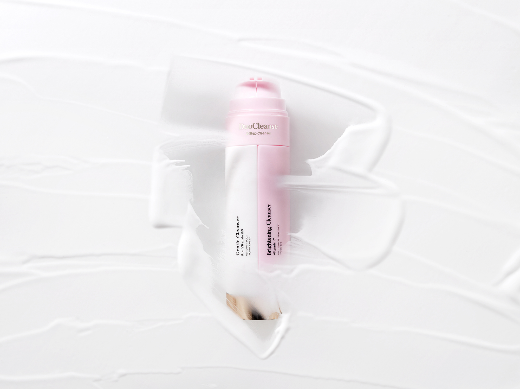
Clean clinical. White or near-white backgrounds, controlled directional light, minimal styling, evidence-led visual language. The work signals efficacy, trust, and scientific seriousness.
High-gloss luxury. Deeper backgrounds, controlled reflections, premium material treatment, restrained styling. The work signals indulgence, price-point justification, and aspiration.
Editorial beauty. Styled compositions, atmospheric lighting, often skin-and-product or product-in-context. The work signals lifestyle, personality, and emotional connection.
These are not aesthetic flavours. They are commercial registers, and they each do different work for the brand.
Clean clinical: when efficacy needs to be visible
Clean clinical is the right choice when the customer’s first concern is whether the product works.
Skincare brands launching a clinically-positioned hero serum. Cosmetics brands whose differentiation is ingredient transparency. Wellness brands whose customer is reading the label as much as the packaging. Brands targeting Boots, Holland & Barrett, Cult Beauty, where the customer’s purchase decision is rational before it is emotional.
The visual language: white or off-white backgrounds. Soft directional light from a single dominant source. Crisp shadow that reads as honest rather than dramatic. Minimal props, sometimes none. The product, often photographed straight-on or at a shallow angle, occupying the frame with confidence.
Clean clinical fails when it is used for brands whose customer wants emotional permission rather than rational reassurance. A luxury fragrance shot in a clean clinical register reads as cheap. A skincare hero shot in a high-gloss luxury register reads as untrustworthy.
High-gloss luxury: when finish carries the price tag
High-gloss luxury is the right choice when the price-point of the product is itself part of the selling proposition.
Premium skincare at the Sisley, La Mer, Augustinus Bader end of the market. Luxury fragrance from heritage houses. Prestige cosmetics where the packaging is a visible signal of value. Brands targeting Selfridges Beauty, Liberty, Harrods, where the customer is paying for the experience as much as the product.
The visual language: deeper backgrounds, often coloured or textured. Controlled reflections that signal premium material. Lighting that reveals finish (lacquer, glass, gilt, mirror) without flattening it. Restrained styling, with any props chosen for material echo rather than narrative.
High-gloss luxury fails when it is over-applied. A whole skincare range shot in this register reads as visually uniform and the customer loses the differentiation between products. The dial works best for hero pieces, with the supporting range shot in a calmer register that lets the heroes stand out.
Editorial beauty: when the product needs to feel desired
Editorial beauty is the right choice when the brand is selling lifestyle, aspiration, or emotional connection rather than specification.
Independent beauty brands building cult positioning. Lifestyle-led brands whose product range is part of a larger brand world. Heritage brands launching a collection that benefits from contextual storytelling. Brands whose customer follows them on Instagram before buying.
The visual language: styled compositions, often product-in-context (on a vanity, in a hand, beside a candle). Atmospheric lighting that creates mood rather than information. Colour palettes that may shift between collections to reflect seasonal or thematic positioning. Compositions that breathe rather than fill.
Editorial beauty fails when it is used for the wrong stage of the customer journey. PDP imagery shot purely editorially is rarely retailer-compliant and often fails to give the customer the rational information they need to convert. The dial works best for campaign hero, paid social, organic content, and press. Pair it with a clean clinical or high-gloss register for the PDP layer.
Choosing the dial by launch objective (not by mood board)
The framework that helps senior teams make the call:
Name the customer’s first concern at the moment they encounter the imagery. If it is “does this work?”, the dial is clean clinical. If it is “is this worth the price?”, the dial is high-gloss luxury. If it is “is this for me?”, the dial is editorial beauty.
That single question, asked at the brief stage, settles 80% of the style decisions.
The remaining 20% is about the customer journey. PDP imagery often needs a different dial than campaign imagery, because the customer’s questions shift between the two stages. A brand can lead with editorial in their campaign and clean clinical on their PDPs without contradiction, as long as both are recognisably the same brand language.
How to keep a single brand language across all three
Working across two or three dials does not mean the brand looks fragmented. The strongest beauty brands work across the full range while remaining instantly identifiable.
The discipline that holds the brand language together:
A consistent colour temperature across all imagery, regardless of dial. The lighting may be soft or directional, the background white or coloured, the styling minimal or atmospheric, but the underlying warmth or coolness stays constant.
A consistent compositional logic. The brand may shoot heroes centred or off-centre, but it commits to one and holds it across formats.
A consistent retouch direction across dials. The clean clinical work and the editorial work may be visually different, but the retouch standard, the colour saturation level, and the contrast philosophy stay aligned.
A consistent prop and styling library. Props may change between dials, but they come from a shared visual vocabulary. The prop that appears in the editorial campaign should not look out of place if it surfaced in the high-gloss campaign.
This is brand identity work, not photography work. The studio’s job is to hold the discipline once the brand has named what consistency looks like for them.
When a launch needs more than one dial in the same set
Some launches require two dials in a single asset set. A new fragrance with both a clean clinical PDP layer and a high-gloss campaign hero. A skincare hero with editorial paid social around it.
This is doable on a single production day if the planning is right. The dials are scheduled into separate blocks, with set changes between them. Lighting transitions are planned in advance, not invented on the day. The retoucher gets two direction notes, one per dial, with the master file for each clearly labelled.
What does not work is trying to deliver two dials from one lighting state. The result is imagery that satisfies neither register. If the brief calls for both, the production has to budget time for both.
If you are scoping a launch and unsure which dial earns it, share the launch objective and we will suggest the dial that fits.
Share your brief. We will come back the same day.