

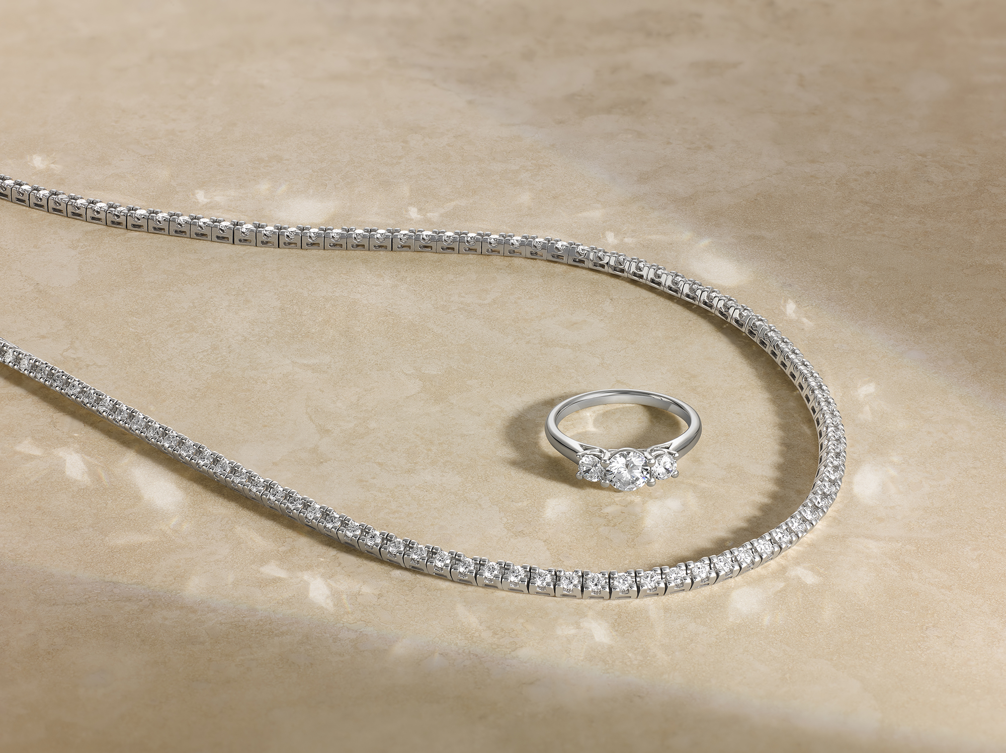
Jewellery photography fails for three reasons, and they are almost always the same three.
The stone does not read as the stone the customer would see in real life. The setting looks heavier or lighter than it actually is. The scale of the piece is impossible to judge from the image. Every other technical concern in jewellery photography is downstream of these three.
This guide is for jewellery brands, retailers, and luxury houses commissioning photography in London. It is about what good looks like across the three things that matter most, and how a specialist studio approaches each.
Why jewellery photography fails on three things, and what they are
A customer looking at a piece of jewellery online is asking three silent questions before any aesthetic ones.
Is the stone as good as the photograph suggests? Is the setting honest about the metalwork? How big is this thing actually going to be when it arrives?
If the photography fails any one of those questions, the customer either does not buy or returns the piece when it arrives. Both outcomes hurt the brand. Returns are expensive in jewellery, and a returned piece often comes back with the original packaging dismantled and the protective film removed.
The studio’s job, before any creative consideration, is to answer the three questions honestly. The creative work sits on top of that foundation.
Stone: clarity, colour, sparkle without exaggeration
The stone is the part the customer studies hardest.
Clarity has to read accurately. A diamond shot under flattering light can look flawless when the actual stone has visible inclusions. The customer either gets disappointed on arrival or, worse, returns the piece because the actual product does not match the marketing image. Honesty pays back faster than enhancement does.
Colour has to read accurately. A sapphire shot in mixed colour temperature looks the wrong shade of blue. A ruby shot too warm reads as orange. An emerald shot too cool reads as green-grey. The studio’s job is to lock the colour temperature, calibrate against a reference, and capture the stone as it is rather than as it might be under different conditions.
Sparkle has to read believably. Diamonds and other refractive stones throw light in specific ways under specific lighting setups. A diamond can be lit to maximise fire, but if the lighting is so aggressive that the sparkle reads as artificial, the customer’s eye flags it. Restrained, accurate sparkle out-converts exaggerated sparkle every time.
Setting: metal finish, prong fidelity, hallmark legibility
The setting is where the customer judges the engineering.
Metal finish has to be accurate. Yellow gold, white gold, rose gold, platinum, and silver all have specific tonal qualities. A platinum ring shot warm reads as white gold. A rose gold setting shot cool loses the pink. Lighting and white balance choices that flatter the stone often misread the metal, so both have to be balanced rather than optimised separately.
Prong fidelity matters more than most generalist studios realise. The way a prong sits against the stone, the way it tapers at the tip, the way it relates to the gallery underneath, all signal the maker’s craftsmanship. A photograph that hides or distorts the prongs underclaims the work that went into the piece.
Hallmark legibility is part of the trust signal for higher-value pieces. The customer often wants to see the hallmark, particularly on heirloom-quality work or on pieces priced at a level where authentication matters. A side-angle shot that reveals the hallmark is worth its place in the asset matrix.
Scale: making a 4mm stone read at thumbnail size
Scale is the question generalist jewellery photography most often gets wrong.
A piece photographed in isolation against a clean background tells the customer almost nothing about how large it actually is. A 0.5 carat solitaire and a 2 carat solitaire can look identical in a hero shot if there is no scale reference.
The honest answers: include a scale reference where the brand allows it (a hand model, a measurement card, a complementary object). Capture a side-by-side composition that contrasts pieces of different sizes within the same range. Provide a “lifestyle on hand” shot for any piece where the wearable scale matters to the buying decision.
For pieces shot purely in isolation, the composition itself can carry scale information. A piece photographed with deliberate negative space around it reads larger. The same piece photographed tight in the frame reads smaller. Composition choices have commercial consequences.
Lighting logic for diamonds, coloured stones, pearls
Three materials, three lighting approaches.
Diamonds. The lighting goal is to capture fire and brilliance honestly. Directional light from a soft source above and slightly to the side, with controlled fill, gives the cleanest result for round brilliants. Other cuts (princess, emerald, marquise) need adjustments based on how the cut returns light. Polarising techniques can help control internal reflections without flattening the brilliance.
Coloured stones. The lighting goal is colour fidelity. The colour temperature of the lighting setup has to match a calibrated reference. Mixing strobes with ambient daylight is a common mistake that drifts the colour. Saturation control in retouch should bring the photograph to match the actual stone, not to enhance beyond it.
Pearls. The lighting goal is surface and lustre. Pearls have a specific iridescence that requires soft, wrapping light to capture. Direct light flattens the surface. The lighting setup also has to manage colour cast: pearls reflect their environment, so a coloured background or coloured prop will tint the pearl in the image. White, neutral surroundings keep the pearl honest.
Multi-piece collections: keeping a collection visually coherent
A jewellery collection on a brand’s website or a retailer’s category page lives or dies on visual coherence.
The discipline that holds a collection together: a master lighting state held across every piece, even when individual pieces would benefit from variation. A shared composition logic, including identical framing, identical shadow direction, and identical background tone. A shared retouch direction, calibrated once and applied uniformly.
For collections that mix metal types or stone types, the lighting may need to step rather than glide between subgroups. All white-metal pieces in one block, all yellow-gold in another, all coloured-stone pieces in their own. Within each subgroup, the consistency is held.
This is the same principle that holds a watch photography collection together, applied to jewellery.
Retouch boundaries: enhancing without inventing
Jewellery retouch operates within tight ethical lines.
What can be cleaned: dust on the stone, fingerprints on the metal, environmental reflections that distract from the piece, micro-scratches on the band that are not part of the piece’s character.
What can be enhanced: the depth of the metal finish to match the brand’s existing reference style, the contrast on engraved hallmarks so they read at small sizes, the saturation of a coloured stone so it matches the brand’s calibrated reference (not exceeded).
What should never be invented: clarity that the stone does not have, colour that the stone does not exhibit, prong work that does not exist on the piece, brilliance that exceeds what the stone naturally produces.
The customer who buys a £4,000 piece and receives something that does not match the photograph will return it, and they will tell their network about the discrepancy. Honest retouch is risk management as much as it is craft.
What good looks like for the brief
The strongest jewellery briefs we receive include: the piece list with metal types and stone specifications, the brand’s existing campaign tone reference, the approval owners, the on-set requirements (security, handling, transit), and the delivery deadline.
What they do not include: extensive aesthetic moodboards, attempts to brief the lighting in advance, or wishlist features that exceed what the piece naturally has. Those decisions belong with the studio.
If you are scoping a jewellery shoot in London, send the collection list and we will plan the lighting before you ship the pieces.
Share your brief. We will come back the same day.