

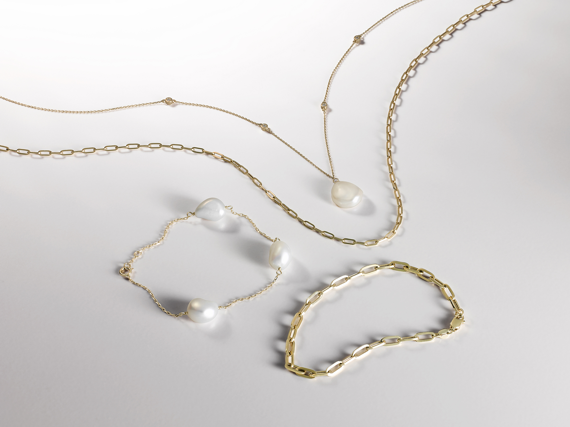
Three materials. Three lighting problems. Three ways the photograph can quietly misrepresent the piece.
Most jewellery briefs treat diamonds, pearls and coloured stones as the same kind of subject. They are not. Each behaves differently under light, each rewards a different lighting approach, and each fails commercially in a different way when the lighting is wrong.
This guide is for jewellery brand teams and creative leads working with a luxury jeweller’s portfolio that spans more than one material. It is about how a specialist studio approaches each, and what to brief differently when the same shoot day involves all three.
Three materials, three lighting problems
Light interacts with diamonds through refraction. The stone bends and disperses incoming light, throwing internal flashes of spectral colour the trade calls fire, alongside the white-light brilliance that makes a well-cut stone appear to glow from within.
Light interacts with pearls through surface reflection. The pearl has an organic surface layer, the nacre, which produces a characteristic depth-of-light known as orient. The pearl absorbs ambient colour from its surroundings, which means the lighting environment is part of the photograph in a way it is not for harder stones.
Light interacts with coloured stones through a combination of refraction, absorption, and surface reflection that varies by species. A ruby behaves differently to a sapphire, which behaves differently to an emerald, which behaves differently to a tanzanite. Each has its own optical fingerprint.
Treating all three as variations on the same problem produces photographs that are technically competent but commercially compromised. Treating them as three distinct disciplines produces work that earns the brand’s price point.
Diamonds: refraction, fire and the honest sparkle
Diamond photography is the most studied area of jewellery imaging, and most generalist studios know the basics. Where they fall short is in the calibration.
The lighting setup that serves diamonds best uses a soft, broad overhead light with controlled directional fill from one side. The overhead provides the brilliance return. The directional fill picks up the fire. The trick is balancing the two so the stone reads as alive without looking like it is being theatrically lit.
Cut shape changes the lighting decisions:
Round brilliants are the most forgiving. Standard setups work well, and the cut returns light evenly from most angles.
Princess and emerald cuts have flat tables that need attention to avoid hot reflection points. Slight angle adjustments to the camera position help.
Marquise and pear cuts have asymmetric returns and benefit from a composition that respects the stone’s directional energy.
Old European and old mine cuts return light less aggressively than modern brilliants. The lighting often needs to be softer to avoid making them look dim by comparison.
The retouch principle for diamonds: clean the dust, hold the brilliance, never add fire that is not there. A stone that exhibits modest fire in real life should exhibit modest fire in the photograph. Customers who buy diamonds know what to look for.
Pearls: surface, lustre and the colour cast trap
Pearl photography is where most generalist studios visibly struggle.
The pearl’s nacre is reflective in a way that makes the lighting environment part of the captured image. A pearl photographed against a coloured background takes on the colour. A pearl photographed near a coloured prop reflects the prop. A pearl photographed under mixed colour temperature lighting reads as discoloured.
The setup that serves pearls best uses neutral, controlled surroundings. White or near-white background. White or near-white props if any are present. Soft, wrapping light from a broad source to capture the orient without harsh highlights. Colour temperature locked to a single value across the entire shoot.
Different pearl types ask for slight variations:
Akoya pearls are the most reflective and need the cleanest environment. Any colour cast will surface immediately.
South Sea pearls have warmer body colour and tolerate slightly warmer lighting, but the principle of neutral surroundings still holds.
Tahitian pearls have natural colour variation across grey, green, peacock, and aubergine. The lighting should reveal that natural colour without exaggerating it.
Freshwater pearls vary widely and may need stone-by-stone adjustment within a single shoot.
Pearls also need careful handling. They scratch more easily than other gems, and they should never be cleaned with abrasive cloths or chemical products on set.
Coloured stones: saturation truth across rubies, sapphires, emeralds
Coloured stones live or die on saturation truth.
The customer buying a £6,000 sapphire ring has spent time looking at sapphire colour grading guides. They know the difference between a Kashmir sapphire and a Madagascar sapphire. They know that royal blue is not the same as cornflower blue. A photograph that misrepresents the colour, even slightly, undermines the trust the brand has built.
The setup that serves coloured stones best is the same colour-disciplined lighting used for diamonds, with one additional concern: the lighting must reveal the stone’s actual hue without enhancing it.
Specific challenges by species:
Rubies are sensitive to warm lighting that can make them read as orange or pink-orange rather than true red. The best red rubies have a slight blue undertone, and the lighting should preserve that.
Sapphires are sensitive to cool lighting that can flatten the depth of blue. The best sapphires have internal velvet quality, and the lighting should reveal it.
Emeralds are sensitive to lighting that exaggerates their green or, worse, makes them appear yellow-green. They also commonly have visible inclusions that should be photographed honestly rather than hidden.
Tanzanite, alexandrite, and other colour-shifting stones present a specific challenge: they show different colours under different light sources. The brand needs to specify which lighting condition the photograph should represent.
Mixed pieces: stones and metals in the same frame
A piece that combines stones and metal elements requires lighting that serves both.
The studio cannot optimise for the stone alone, because the metal will misread. The studio cannot optimise for the metal alone, because the stone will look dull. The compromise lighting state has to be calibrated for the specific piece.
The principle that helps: identify the dominant element commercially. If the piece is a diamond ring with a platinum band, the diamond is the commercial driver and the lighting should serve it first, with the platinum captured honestly within that setup. If the piece is a gold cuff with small accent stones, the metal is the driver and the lighting should serve the metal first.
For complex pieces with multiple stone types and metal finishes (a tiara, a necklace, an elaborate cocktail ring), composite work is sometimes the right answer. Multiple captures with different lighting optimisations, combined in retouch, can produce a final image that respects every element of the piece.
When macro is the hero, and when it is the detail
The asset matrix for a jewellery shoot should specify both hero composition and macro detail, by piece.
Hero composition shows the whole piece in the customer’s mental scale. Macro detail shows a specific element (the stone setting, an engraving, the clasp mechanism) in close-up.
Each format has its own commercial purpose. Hero composition lives on the category page, the search result, and the retailer carousel. Macro detail lives on the product page deep-scroll, in the brand’s editorial content, and in the press release.
A common scoping mistake is over-investing in macros and under-investing in hero composition. The macro is more visually arresting in the brief stage. The hero is what actually converts on the jewellery photography PDP.
What to brief a jewellery photographer about each piece
The brief that produces the strongest jewellery photography includes, per piece:
The metal type and finish (yellow gold, white gold, platinum, silver, mixed). The stone type, cut, and approximate carat weight where relevant. Any specific colour grading or characteristics the brand wants represented honestly. The piece’s commercial position (hero of the collection, supporting piece, special edition). Whether the piece allows a hand model or scale reference. Any handling restrictions for high-value pieces.
What does not need to be in the brief: lighting instructions, camera settings, attempts to specify the technical setup. Those decisions belong to the studio.
If your brief has a mix of materials and you would like help thinking through the production approach, share the materials list and we will show you the lighting approach we would take.
Share your brief. We will come back the same day.